A rebrand for Wise Women came with a shiny new logo and website!
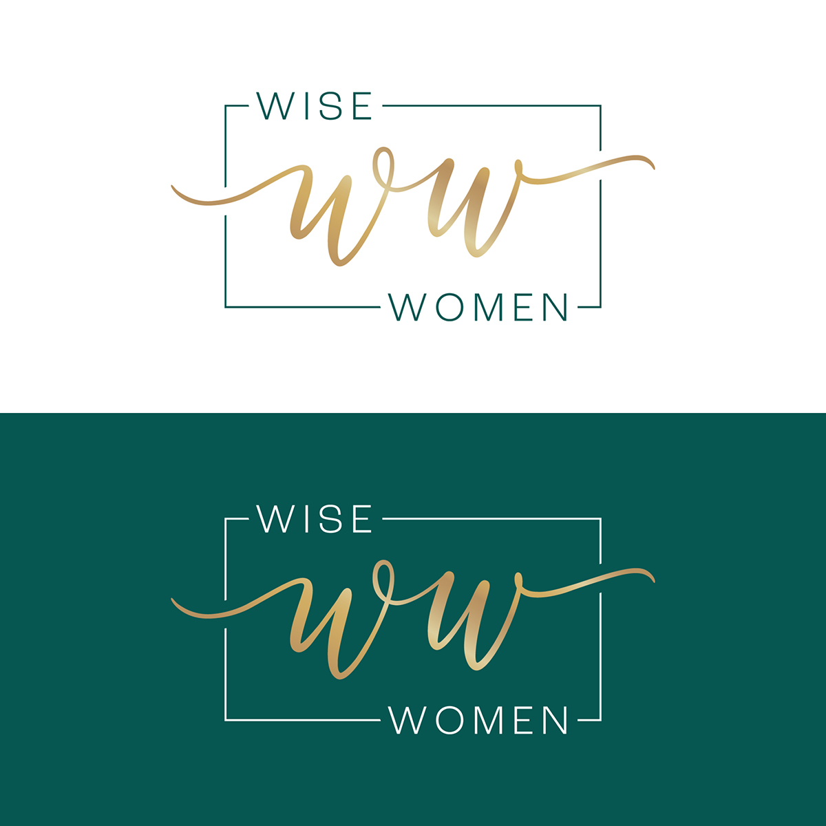
Logo: In its simplicity, the entrance and exit strokes of the WW monogram symbolize outstretched and linking arms, which mirrors the connection and community cultivated through Wise Women, a community of female leaders that gathers for monthly luncheons.
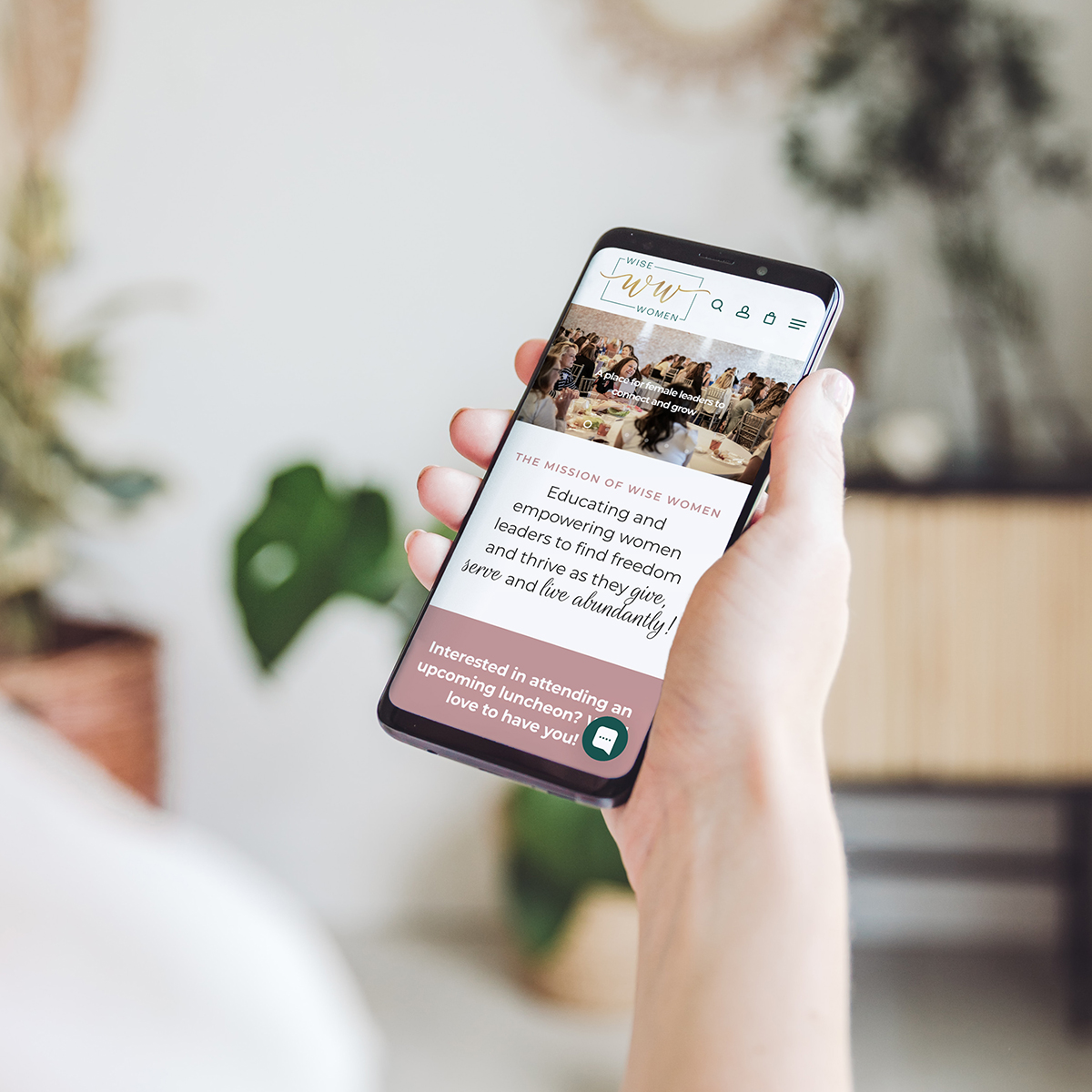
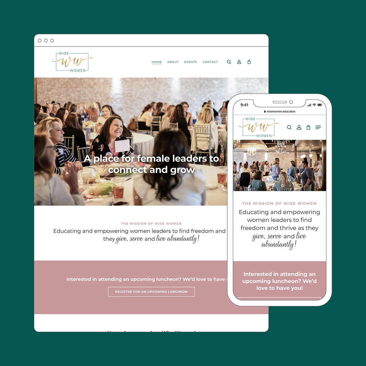
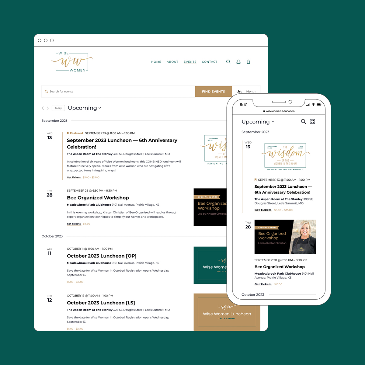
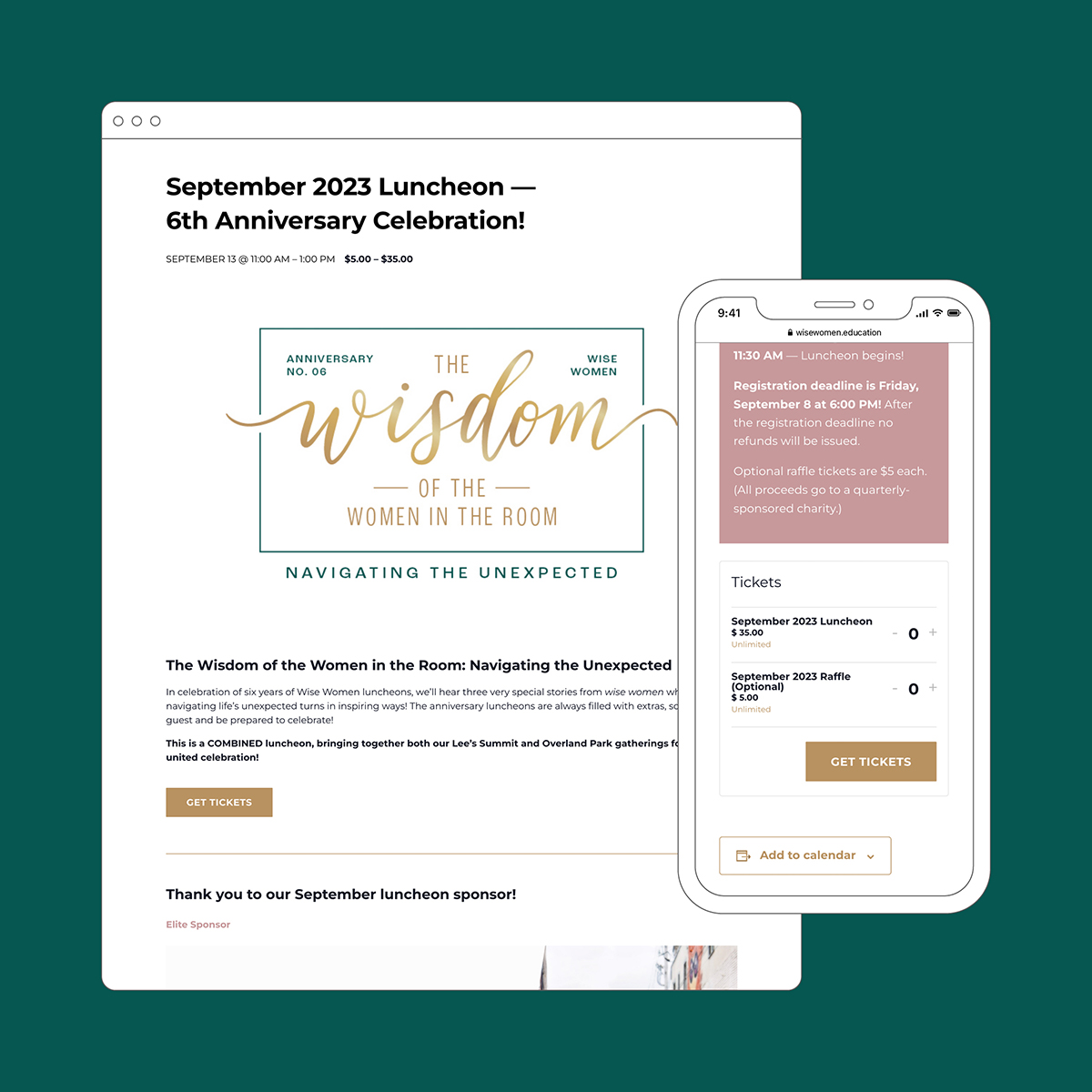
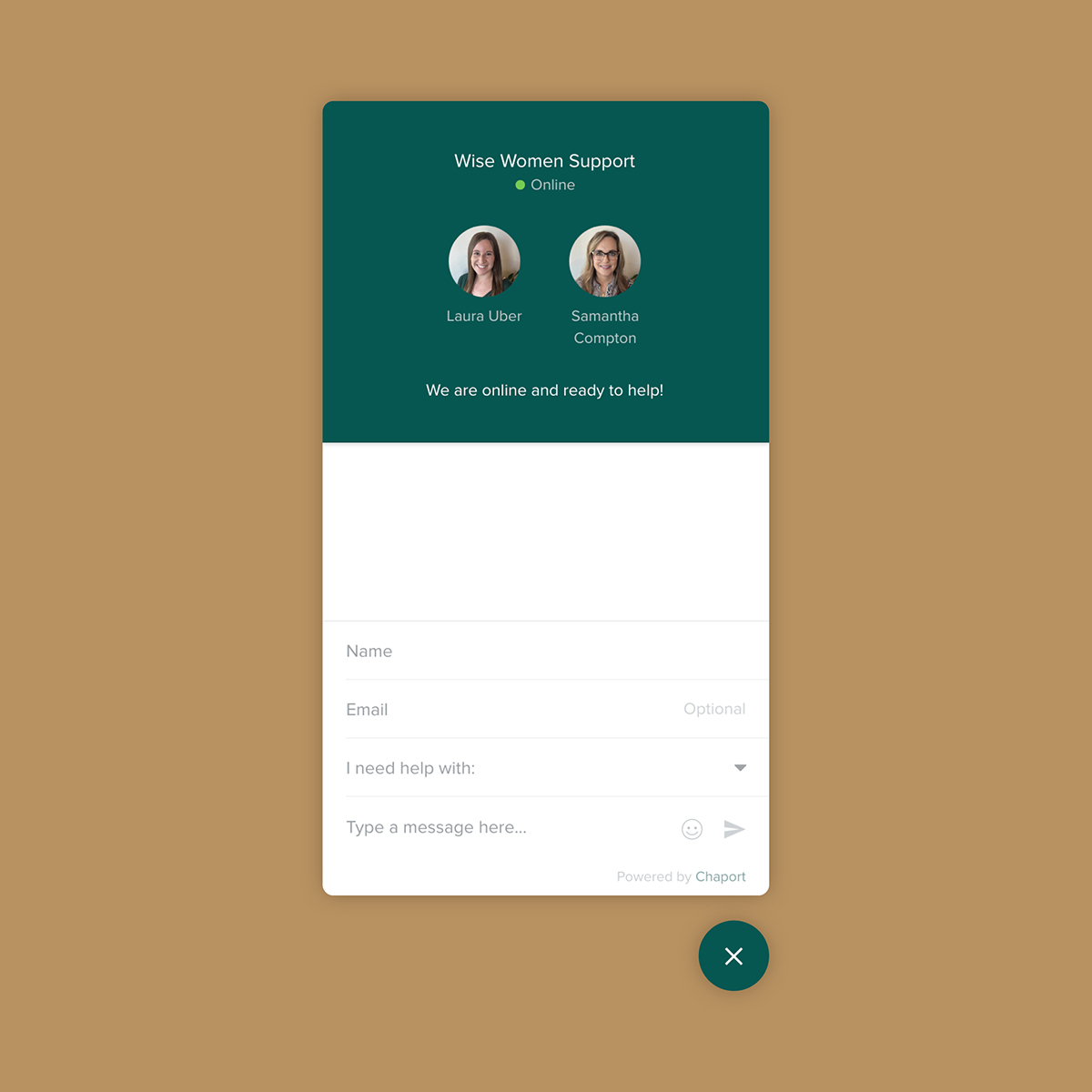
Website: The redesigned website not only reflects the rebrand, but it also features a new calendar and ticketing system, making it easier for users to purchase luncheon and raffle tickets. A chat feature also enables Wise Women leaders to support users with any technical challenges as they adjusted
Additional rebranded items included name badges, lanyards, email signatures, presentation decks, business cards, social profiles, etc., to support the new direction.
Check out the full site at wisewomen.education!